Year
2025
Client
PERSONAL
Category
Portfolio
Product Duration
3 DAYS
Most e-commerce redesigns treat strategy as an afterthought, leading to disconnected user journeys where the "story" doesn't match the "sale." Competitor analysis revealed that users were bouncing because they couldn't find the emotional hook behind the product.
By visualizing the competitor landscape and identifying gaps in their storytelling, I built a site structure that guides the user from emotional discovery directly to the transactional conversion.
After analyzing Gen-Z browsing habits and competitor UX, I identified three critical friction points that formed the basis of my strategy:
Discovery: The target demographic does not shop linearly. They expect exploration. I prioritized "vibe-based" filtering over technical specification lists.
Visual Validation: Users require high-fidelity visual context before committing.
Speed is Currency: Analysis showed that complex animations often kill conversion rates on mobile. I focused on lightweight, interactions.

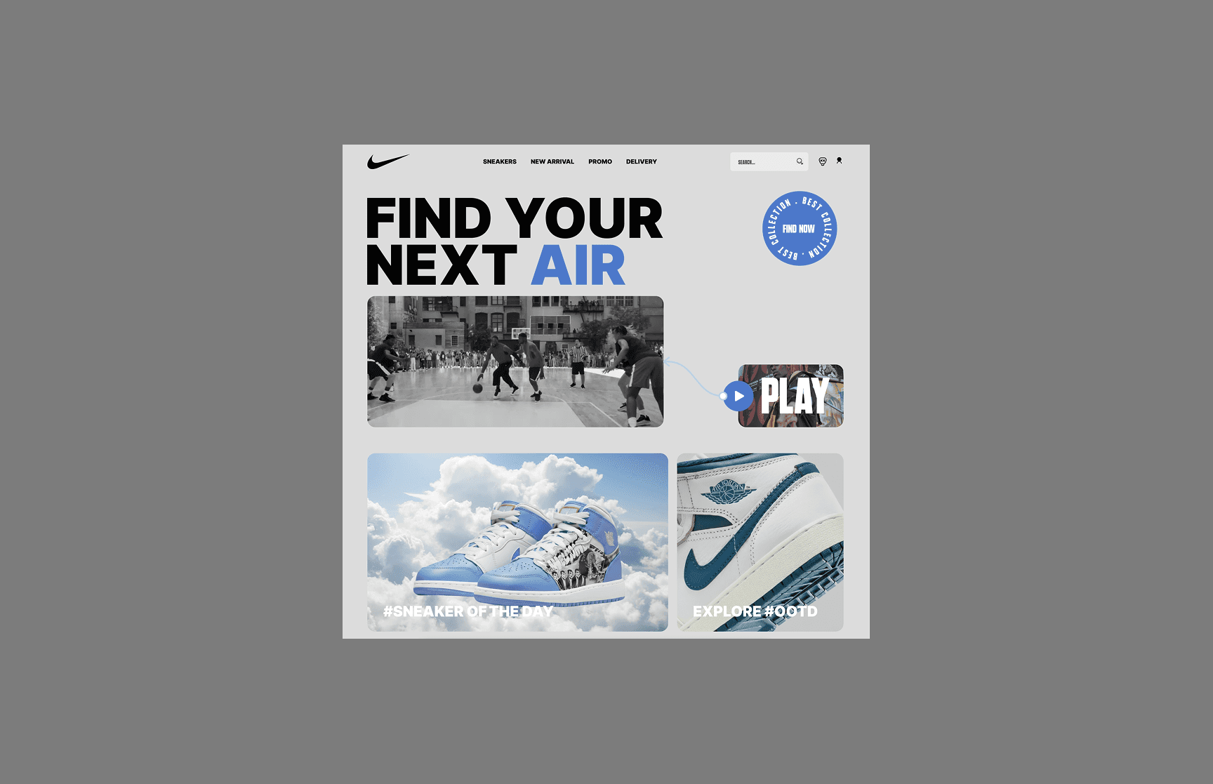
The "Air" line has hundreds of variations. Standard dropdown menus and pagination create decision fatigue, causing users to abandon the search before finding their preferred model.
I designed a visual filtering system using "Pill" interactions. This simplifies the visual field, allowing users to toggle between models instantly. By removing page reloads and using conditional component variants, I reduced the friction between discovery and purchase, keeping the user in the "flow state."
I introduced a sticky horizontal scroll interaction. This disrupts the vertical scroll pattern, locking the viewport and sliding the cards from right to left. This UX pattern forces the user to engage with the lifestyle imagery and validating relationship between his prefferable style and the "street culture" aesthetic of the brand.

The cognitive noise distracts the user from the primary goal.
I stripped the interface down to its essentials, adopting a "Cinematic Commerce"
approach.